Setting your sights on the famous Golden Arches is as synonymous as the McDonald's name itself.
And sometimes catching a glimpse of the bright yellow neon signage can be the reason why we call in to the drive-thru for a quick pick me up, especially after on the commute home after a long day at work.
But it wasn't too long ago that the famous McDonald's logo turned things on its head.
When we say that, we mean it literally.
Advert
The Maccies logo is ranked as fifth most recognisable in the world behind Microsoft, Nike, Google and Coca-Cola having first been shown to the public back in 1962.
They're stayed put ever since.
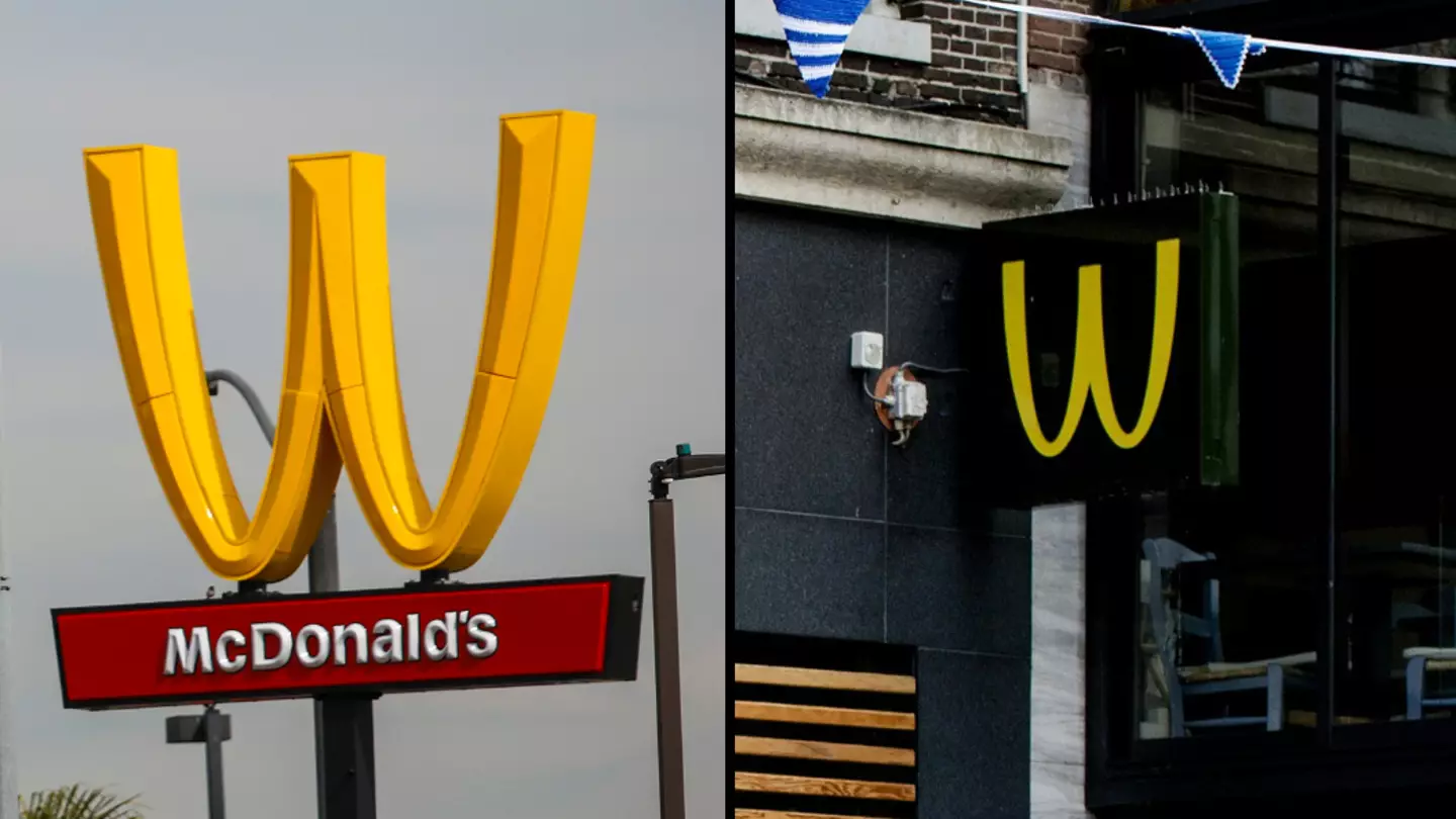
Yet for two years last decade, McDonald's flipped the Golden Arches as it marked one specific day in the calendar.
Maccies made the statement - and a pretty important one in that - at branches in the United States of America.
What was it all about?
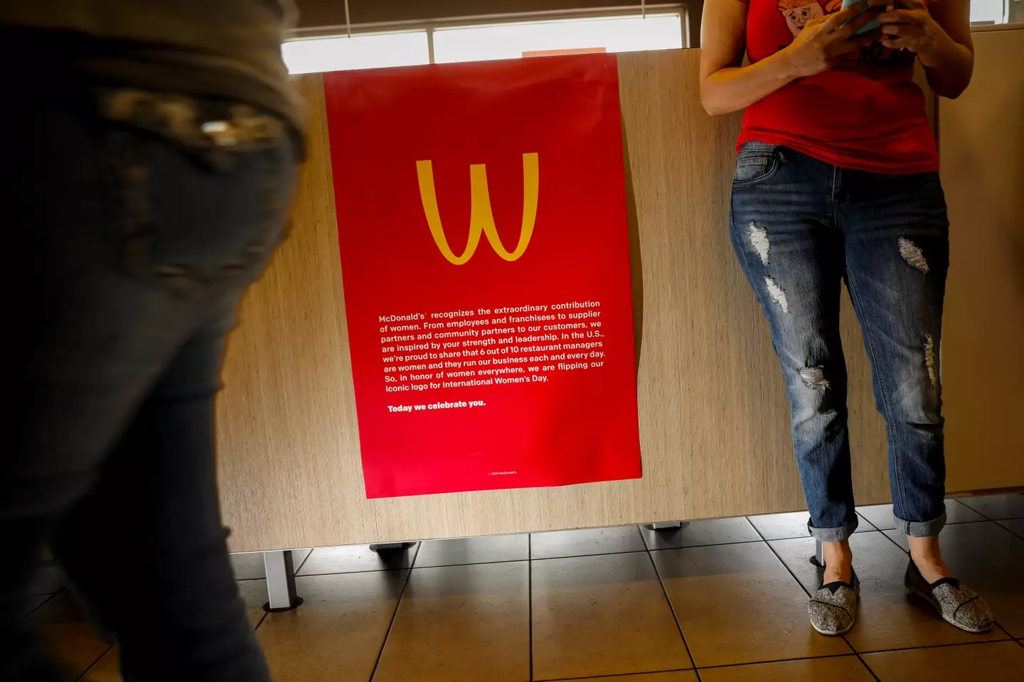
Maccies made the temporary yet big change to its brand in recognition of International Women's Day.
Advert
With 60% of its managers in the USA being women, the company took a stance to recognise the women who have helped make the company what it is today.
So we said goodbye to the famous M and welcomed in the W. A dub for Maccies indeed on this one.
McDonald's chief diversity officer, Wendy Lewis, said the flip was meant to honour women everywhere and within the company.
Where did it happen?
Only one branch undertook the change.
Advert
It was at a Californian outlet with images of the Ws shared right across Facebook, X (then Twitter), and Instagram.
Merch was even put together to commemorate the gesture. We're talking t-shirts, hats and packaging at 100 American franchises.
What was reaction like?
There was a lot of praise for the move as well as the usual sniping from social media users.
Advert
One wrote: "Happy International Women’s Day! Love this from McDonald’s!"
A second joked: "Quick shout out to Wendys for supporting International Women’s Day every day."
Laura Parker, then national coordinator for Labour pressure group Momentum, said the move was 'McFeminism'.
On X, another critic wrote: "How much did this sign swap cost? How is that helping women?
Advert
"Cheaper than traditional advertising is likely the real deciding factor."
Has Maccies done it before?
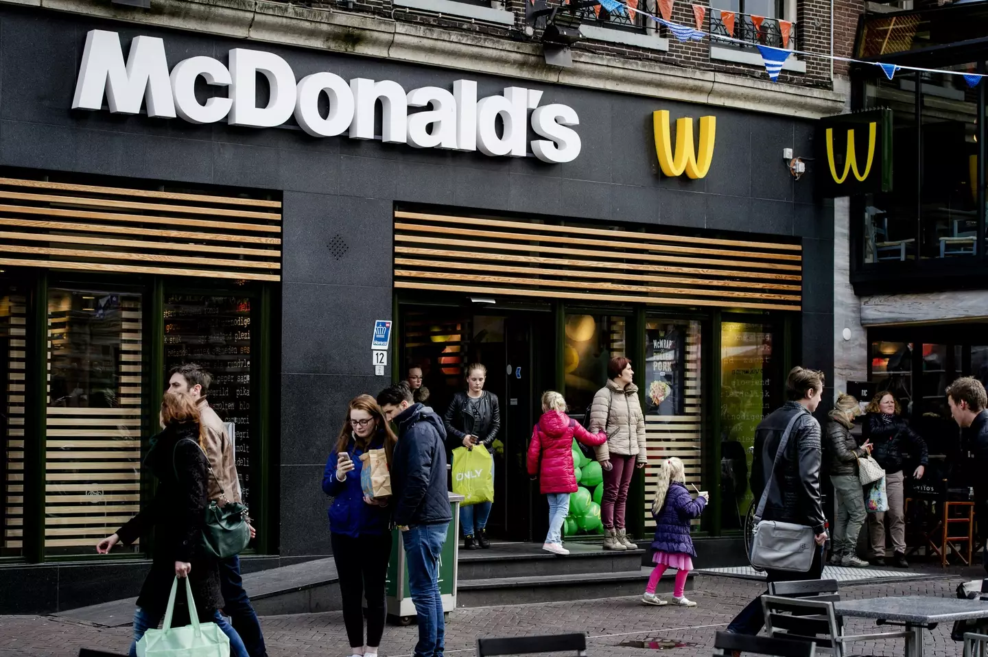
The Golden Arches have been flipped for years. But for different reasons in different locations around the world.
In the Netherlands, on King's Day in 2017 the logo was changed to a W at an Amsterdam restaurant in honour of King Willem.
It's also been done as part of the 'WcDonald's' marketing campaign. It's Maccies way of recognising and supporting how many productions in the anime and manga world flip the logo as a way to quickly represent fast food restaurants without violating copyright laws.
Featured Image Credit: Jay L. Clendenin/Los Angeles Times via Getty Images/ROBIN VAN LONKHUIJSEN/AFP via Getty ImagesTopics: McDonalds, Food And Drink, World News, UK News, US News, Viral, Social Media